min read
December 4, 2025
Designing Crafty’s New Look: The Story Behind Our Rebrand
A fresh logo, a fresh feel, and the meaning packed inside every curve.
Hey....

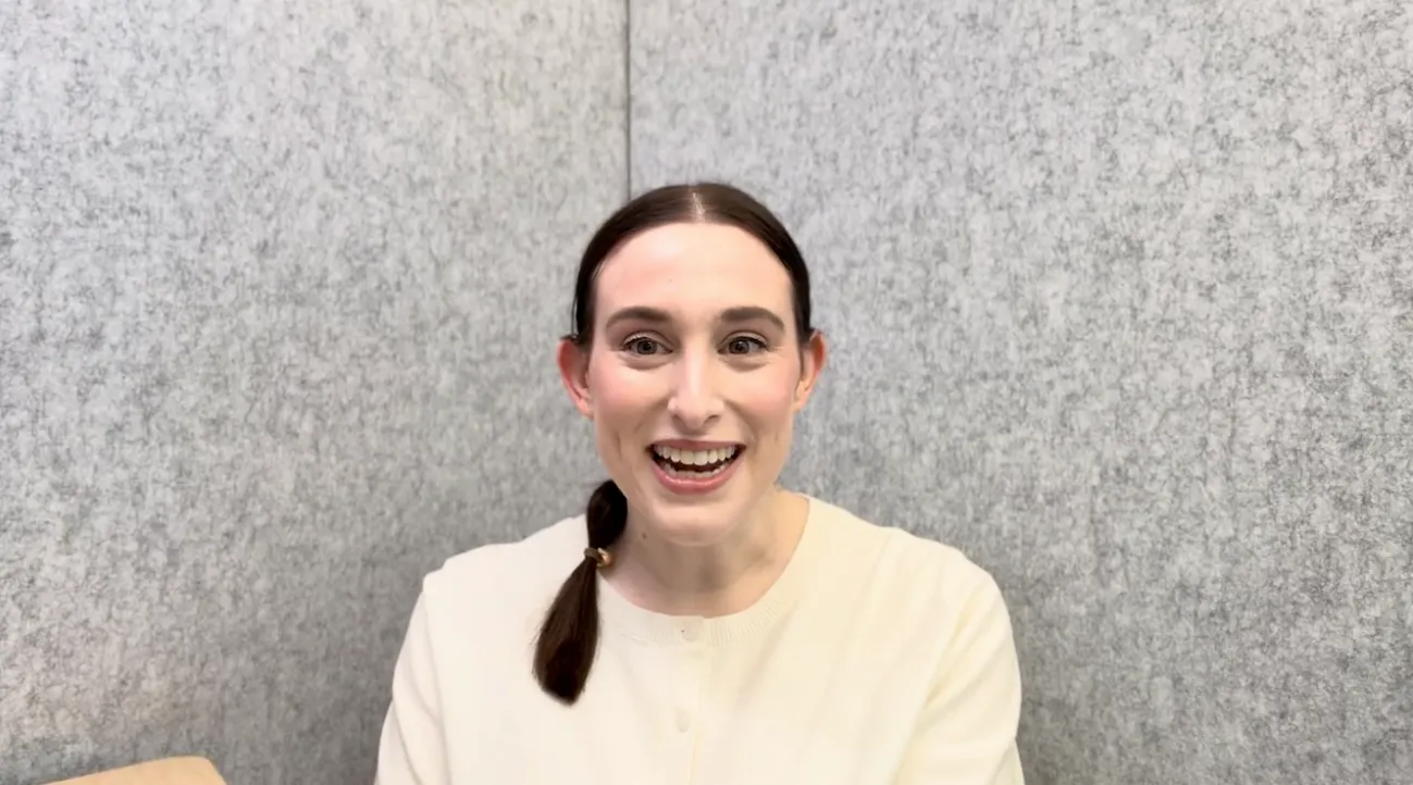
I’m Rebecca Ross, part of the incredible team behind Crafty’s recent rebrand and our new logo. By day, I’m Crafty’s Growth Marketing Manager, focusing on creating a sustainable pipeline and all the optimizations that go into that. But, I also happen to be a designer and took on the challenge of redesigning Crafty's brand identity and the new logo we're all so excited about!
I want to give you a peek behind the curtain: what led to the change, what we wanted the brand to say, and how even a single curve in a letter was chosen with care. Because at Crafty, we sweat the small stuff, and it’s those details that make the biggest difference.
Why It Was Time for a Change
Put simply: our old logo was built around 2015 Crafty. A small startup in Chicago that delivered kegs to offices (yes, that's the Chicago flag on the bottle).
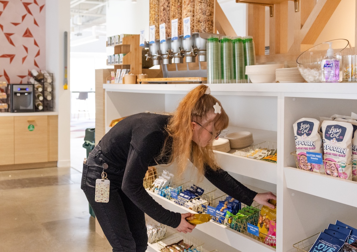
What started as a fun nod to our early days no longer reflects who we are. Crafty has grown into a national partner that powers tech-enabled office pantry programs: think snacks, coffee, beverages, water, and all the small moments that fuel employees throughout the workday.
It Started with the Pantry
The pantry became our guiding metaphor.
Because when you really look at a Crafty-stocked pantry or fridge, there’s something beautiful happening: everything is a different shape or size, and yet it fits together perfectly.
That’s what Crafty does for top workplaces:
- We make things work, even when no two offices are the same.
- We stock everything with care and intention.
- We obsess over making things functional and beautiful.
So when we started designing, that idea was always at the core.
Keeping What Made the Old Logo Loved
One thing we knew for sure: the new brand needed to keep that Crafty charm.
People genuinely loved the old logo. It was fun. A little unexpected. Something you’d wear on a hat or spot on a mug and smile. We didn’t want to lose that energy.
At the heart of it all, Crafty brings joy to the workplace, whether that's the emergency Diet Coke your employee needs to power them through a hard day, the candy that keeps your tech team innovating (our VP of Product couldn't last one day without her mini sweet treats), or giving workplace teams the oversight and control they need exactly how they need it via our platform.
The logo needed to keep that essence of making the workplace just a little bit lighter.
The Typography Design Process
We tried a lot of things. When I say a lot, I mean I have probably over 100+ different options.
We started small with just elevating our existing all-caps wordmark. It looked clean and modern, but something about it didn’t feel right. So we pushed further. We experimented. And eventually, we landed on a custom lowercase version that felt just right.
Every letter was custom-crafted, because Crafty doesn’t do off-the-shelf solutions. Every pantry we build is customized. Every program is tailored to the needs of that specific client. Our logo needed to reflect that same bespoke spirit.
- The "C" looking like it's taking a playful bite
- The “R” curving just right into the “A”
- The "F" tucking into the "T"
- The "Y" rounds out the entire mark
We zoomed in on every curve and space (and I mean Nate literally zoomed in to adjust anchor points, designers will know what I'm talking about), because that’s what we do at Crafty. We care deeply about the details, whether it’s how a letter sits in a logo or how a LaCroix is placed on your shelf.
This wasn’t just about designing a logo. It was about reflecting our entire operational philosophy:
Make things that work beautifully. Sweat the small stuff. Create systems to ensure that every piece reflects the experience you want.
That’s the Crafty way: across design, tech, service, and every client experience.
The Birth of the Hungry Cup
Finding the right icon was its own journey. We explored abstract pantry shapes, snack silhouettes, and plenty of ideas that felt promising, but didn’t quite land.
Then Sarah (check out Sarah's take) suggested: what if we tried coffee?
That clicked instantly. Office food service started with coffee service. And even today, if you have nothing else in your office pantry, odds are, you still have coffee. It’s foundational.
So I started sketching a “C” that looked like a coffee cup. I gave it a handle, also shaped like a “C” because duh, and suddenly, it wasn’t just a cup anymore.
It became:
- A coffee cup ☕ (our roots)
- A hungry face emoji 😋 (we literally feed people)
- A smile 😊 (we make people’s lives easier)
I knew from the moment I finished that this was the clear winner. The icon had to work the same way our programs do: simple at first glance, smart underneath, and built to serve real people.
Why This Logo Feels Like Crafty
This logo might be new, but it reflects everything Crafty has always stood for:
- A tech-enabled service that’s easy, intuitive, and a little magical
- A team that’s as obsessed with the details as you are
- A workplace experience that’s joyful, thoughtful, and modern
And just like a great snack display, all the pieces work together, because that’s how we do things here.
So whether you see it in your office pantry, in your inbox, or on a cup, we hope it makes you smile. That was the goal.
Related Resource
Blog
Why Crafty Is the Best Office Pantry Provider
July 16, 2026
Blog
4 Takeaways to Build an ROI-Driven Pantry Program
July 14, 2026
![The Insider's Guide to Choosing an Office Coffee Service Provider [2026]](https://cdn.prod.website-files.com/68ef636bea7f569ab00567aa/6a555168f749fe9f40bbaaa5_Choosing%20an%20Office%20Coffee%20Service%20Provider.jpg)
Blog
The Insider's Guide to Choosing an Office Coffee Service Provider [2026]
July 13, 2026
Blog
The Comprehensive Guide to Healthy Snacks at Work
July 9, 2026
News
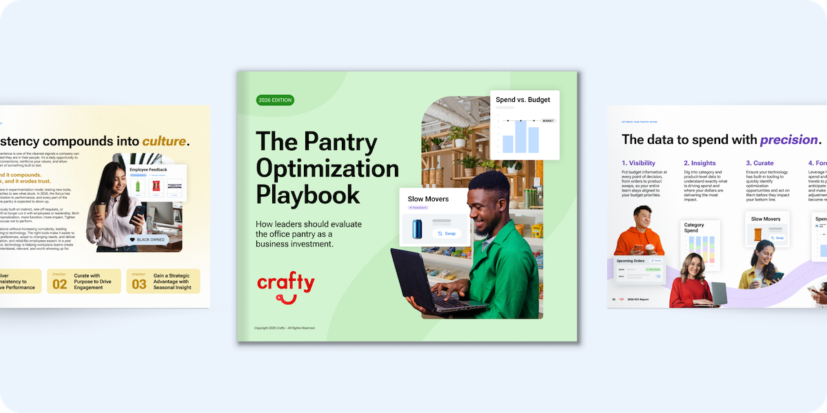
Crafty Launches 2026 Pantry Optimization Playbook as Workplace Leaders Face New Pressure to Prove ROI
July 8, 2026
Blog
Data Bites: The State of Workplace Hydration
July 7, 2026

Blog
August Holidays for Work: Breakroom Snacks to Boost Employee Engagement
July 2, 2026

Blog
7 Learnings from the Mondelez International Snack Report
July 1, 2026
News
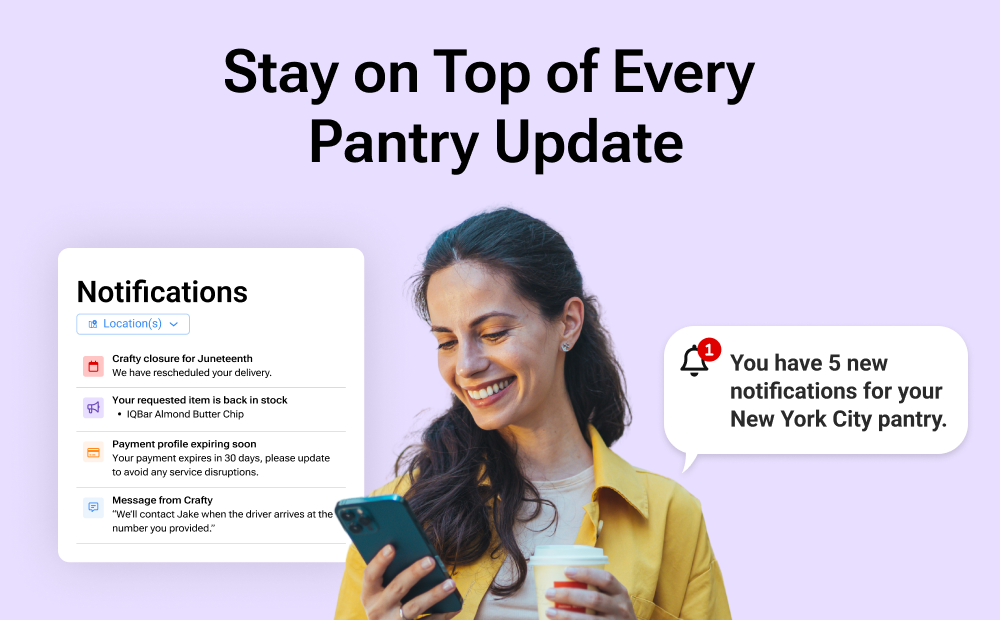
Crafty Launches Notification Center to Give Enterprise Workplace Teams Real-Time Operational Control
June 25, 2026
![The Insider's Guide to Choosing an Office Snack Service Provider [2026]](https://cdn.prod.website-files.com/68ef636bea7f569ab00567aa/6a342b8728e57bbb0e58bd25_Biotech%20Company%27s%20Snack%20Wall%20in%20San%20Francisco.jpg)
Blog
The Insider's Guide to Choosing an Office Snack Service Provider [2026]
June 18, 2026